Information Visualization
A key component of this datathon is the way you communicate and organize the information. Be sure to include at least one type of information visualization to help communicate your analysis.
Graphs
Graphs can help show the 'big picture' from a large number of data points. Some types of graphs include:
Scatter plots

Graph from: https://commons.wikimedia.org/wiki/File:Scatterplot_of_education_and_income.png
Pie Chart

Source: http://www.conceptdraw.com/How-To-Guide/percentage-pie-chart
Bar Chart
Pork Cook Time

Tables
Tables are a useful way to organize a lot of quantitative information (information involving numbers). Sometimes a table is the best way to display information, but be careful, too much information in a table can make it hard to read and understand.

Source: https://www.emarketer.com/Article/Millennials-Most-Likely-SVOD-Netflix-Subscribers-UK/1014885
Area Map
Maps are a good option for demonstrating information that has to do with different locations.
Unemployment Rate by State 2016
Source: http://commons.wikimedia.org/wiki/File:US_unemployment_by_state.svg
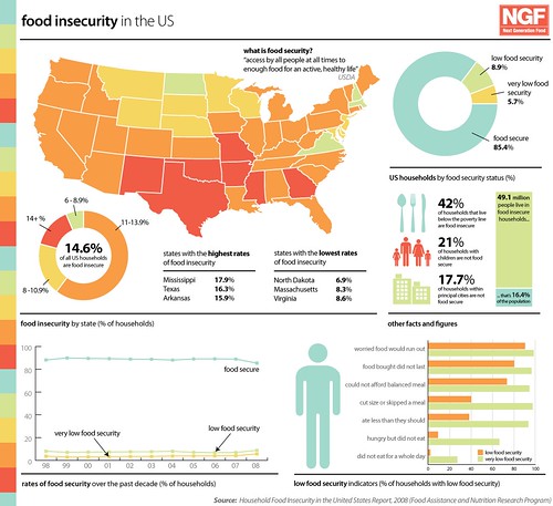
Infographics
Infographics can communicate a large amount of information. They combine data analysis graphics with text to highlight a particular issue or point of view. They always cite their sources, so please make sure you do too.